




Purpose
What we are for, and how it should feel.
People are starting to send a personal agent instead of going themselves. That changes who a business serves. Our purpose is to make sure every business wins that shift, from the first agent that arrives to the millionth. The brand has to carry a serious job without ever feeling heavy.
When someone looks at us, they should feel four things.
Calm
The stakes are real, so the brand stays quiet. Warm stone, ink, one gold, and a lot of air. Nothing flashes and nothing competes.
Playful
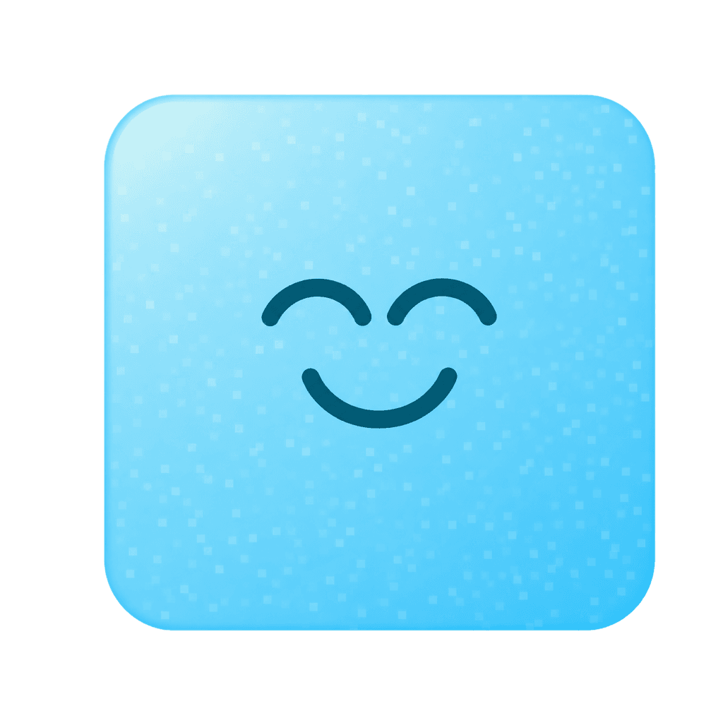
The characters are the warmth. They smile, they drift, they peek over a corner. They are the only thing on the page allowed to be cute.
Clear
Plain words, short sentences, one idea each. If a line needs explaining, it is cut. A page should be understood on the first read.
Sure
We show the thing itself: live scores, real screens, real numbers. Nothing is implied and nothing is dressed up.
Name
The name and the line.
Vibe Labs. Two words, capital V, capital L, never one word and never an acronym. The line is the one sentence we say everywhere, and it does not change from page to page.
Personal agents are your new customers.
We're building the behavioral model of personal agents: the engine that understands how agents think, choose and act for people.
How we write
- Plain words. Short sentences. One idea each.
- No metaphors and no clever lines. One reframe per page, at most.
- Say what the customer gets, not what the product has.
- Headlines are Urbanist at one weight. Nothing on a page is heavier than 500 in display.
Mark
The mark.
A ring, a node at its centre, a node on its rim, and the line between them. It is one colour and takes the colour of the text around it, so it is never recoloured. Give it room; make it big or small, but never cramped.
Lockup
The lockup is the mark beside the name in Geist at medium weight, mark first.
Colour
Colour.
Stone surfaces, ink text, one gold, and the colours you press. These are the colours that do something: they hold text, label it, point, or act. The pastel colours that identify the brand belong to the characters, and live with them below. Every ratio here is measured live against the page.
Surfaces · ratio against the page
Warm stone, not white. The card is the one step up and is carried by a shadow; everything else steps down, so lift and grouping never compete.
surface-0 · page
surface-1 · band
surface-2 · card
surface-3 · inset, hover
Ink · ratio on the page
Ink at four strengths. The faintest is for placeholders and disabled states only; it fails AA for text and is never used for prose.
fg · headings
fg-muted · body
fg-subtle · captions
fg-faint · placeholders only
Accent · the one gold
One gold, and it has a job: it labels and it points. Section eyebrows, the product names in the nav, step numerals, bullet dots, link arrows, the plus on a question, and the focus ring. Never a button and never body text. The hairline and the band tint give it a job at page scale.
accent · eyebrows, numerals, arrows, focus
accent-line · the hairline above a band
accent-soft · one band tint per page
panel-accent · gold inside a product shot
Actions · what you press and what separates
What you press and what separates. The primary button is ink. The secondary button is the soft stone. Hairlines divide rows and frame fields. Red is for a form error and nothing else.
cta · primary button
cta-soft · secondary button
line · hairlines, field borders
danger · form errors
Characters
The cast.
Six characters, one file each, and they are the only character assets. Every variation on the site is CSS on the same file: a background mote is a character small and blurred, a card icon is a circle drawn in CSS with the character coming in from its edge, a peek over a panel is a tilt. Placement comes from a seed, so it is varied across a page and the same on every visit. A seventh character is one file and one line.
sun
tile
arch
house
ghost
wedge
As a card icon · a circle drawn in CSS
As a mote · small and blurred
Hues · ratio of ink on them
The characters carry the vivid set. Each hue is a character's colour and a product's identity; each tint is the field a product shot floats on. These colours never carry text and never act as a control, which is why the ratio shown is for ink on top of them.
hue-mint · AX Usability
hue-sky · AX Personalization
hue-lilac · AX Research
hue-lime
hue-pink
Tints · the fields a screenshot floats on
tint-lime
tint-pink
tint-sky
tint-lilac
tint-mint
Type
Type.
Urbanist for display, at one weight and normal tracking. Geist for body and interface. Line-height is one value each, 1.1 for display and 1.55 for body, never a range.
Hero · 76px
Personal agents are your new customers.
Section · 44–48px
From AI that answers to agents that act.
Card · 26px
Set what each agent may do.
Lead · 20px
The engine that understands how agents think, choose and act for people.
Body · 16px
We write evals for your key jobs and run them hundreds of times across the major personal agents.
Small · 14px
Points lost: 39. You 24, the agent 11, the prompt 4.
Eyebrow · 12px caps
Products
Shape
Shape and depth.
Few radii, and each one visible: 24px is the card, 32px the container a row of cards or a colour field sits in, and every button and tag is a capsule. A 1px line is a state, focus or error, never decoration.
sm …
chips, inner tiles
md …
nested cards
lg …
small cards
xl …
the card
2xl …
containers, fields
full …
buttons, tags
Depth
Depth is a shadow on this light ground because a shadow is a darkening and a light page has room to darken. On the dark theme the same tokens are none, because a near-black page has no room to darken, and a card is a step up instead. One rule, never an outline, in the register each ground can carry.
xs
dense rows
sm
the card
md
card hover
lg
dropdowns
Components
Components.
Everything is built from the tokens above. Buttons are capsules, the primary one in ink. A card is a surface step with the ambient shadow. A product shot never sits on the page; it sits on a field of the section's colour with a character peeking over the corner.
Buttons
Tags and pills
Field
Card and field
Know what to fix first
Every failed run comes with the step, the owner and the fix.

61 / 100
Likely 57 to 65
Last week 63
- Finished
- 64
- Correct
- 56
- Efficient
- 40
- Safe
- 85
- Consistent
- 40
| Task | Muse | Dots | Spark | Gemini | Claude |
|---|---|---|---|---|---|
| Move my flight | 90 | 85 | 78 | 70 | 88 |
| Add a bag (MCP) | 30 | 55 | 45 | – | – |
| Cancel and refund | 20 | 35 | 30 | 25 | 50 |
| Get an aisle seat | 95 | 90 | 85 | 85 | 92 |
Gemini and Claude here are their Chrome agents, which work on websites only.
Points lost: 39. You 24 · The agent 11 · The prompt 4.
Motion
Motion.
Quiet, and slow. Five motions in the set. In a hero the whole cast moves, each character its own way; anywhere else, one character at a time, and nothing else moves on its own. Every motion switches off for visitors who ask for reduced motion. Hover states change colour or lift a few pixels over a short transition.
float
drifts up and tilts, the hero's
bob
a small, quick lift
sway
rocks a few degrees
breathe
grows and settles
spin
a slow full turn
Everything on this page is a token. Change the token, and this page changes with it.
Made with ☕ in NYC · Brand